Seismic hazard model MPS04-S1
DPC-INGV 2004-2006 Agreement
Project S1
Continuation of assistance to DPC for improving and using the seismic hazard map compiled according to the Prime Minister Ordinance 3274 of 2003 and planning future initiatives
Interactive Seismic Hazard Maps 2004-2006
(version 2.0 - 1 January 2019)
Note: Currently the application works properly with the following browsers:
- Firefox
- Chrome
- Explorer
- Microsoft Edge
The application does not work properly with the foolowing browsers:
- Safari
On line help
Introduction
This website disseminates seismic hazard model's data of Italy, released by INGv between 2004 and 2006. The new version implements only the interface for querying and showing data. Data have not been changed.
The system allows to visualize and query probabilistic seismic hazard model of the Italian territory, represented by several shaking parameters on a regular grid spaced by 0.05°.
The maps display two shaking parameters, PGA (horizontal peak ground acceleration) and Sa (spectral acceleration); the unit of measure is g, i.e. the gravity acceleration, corresponding to 9.8m/sec^2. The disaggregation analysis is available for PGA values only.
Maps in PGA were evaluated for different probabilities of exceedance in 50 years (9 probabilities, from 2% to 81%). The distribution of the 50th percentile (median map, which is the reference map for every probability of exceedance) and of the 16th and 84th percentiles (which express the variability of each estimate) are available for each evaluation. The details about the computation of these hazard estimates are available on the page describing deliverable D2 of this project (http://esse1.mi.ingv.it/d2.html)
Maps in Sa were calculated for the same probabilities of exceedance in 50 years (9 probabilities, from 2% to 81%) and for different periods (10 periods, from 0.1 to 2 seconds) as well. Again, the distribution of the 50th percentile (median map, which is the reference map for every probability of exceedance) and of the 16th and 84th percentiles (which express the variability of each estimate) are available for each evaluation. The details about the computation of these hazard estimates are available on the page describing deliverable D3 of this project (http://esse1.mi.ingv.it/d3.html)
Users can select the parameters of the required map in the area Map Selection. Then, pressing the Redraw map button, they will get the required map.
The interface allows the user to obtain details of the selected shaking parameter in graphical format, together with the tabular data, through the instrument Chart, for every single node of the reference grid. From the PGA map the user will get the corresponding hazard curve (the PGA Vs different annual probabilities of exceedance); from the Sa map the user will get the UHS (Uniform Hazard Spectra) for different probabilities of exceedance in 50 years.
In addition, it is possible to obtain details of the disaggregation analysis of the associated PGA value in graphical and tabular format, using the button Disaggregation, for every single node of the reference grid. The mean values of M, D, and ε (the mean magnitude, distance, epsilon values that mostly contribute to the hazard) will be also returned. The details about these analyses are available on the page describing deliverable D14 of this project (http://esse1.mi.ingv.it/d14.html).
Frequently Asked Question
- Q. How to use the buttons above the the map?
- Q. What are the provided hazard values?
- Q. Why values and graphs are not always available for Sardinia and other islands?
- Q. How to ask for the visualization of the map for a specific parameter value?
- Q. How to get the detailed information for a specific node?
- Q. What is the meaning of the disaggregation graph?
- Q. How to read the values on the map?
- Q. How to visualize the points for which it is possible to check detailed results?
- Q. How is it possible to move on a specific point on the map?
- Q. Why borders of municipalities, provinces and regions are not always visualized?
- Q. How to know which part of Italy is actually represented on the main map?
Q. How to use the buttons above the the map?
The buttons above the map are grouped according to the offered fuynctionalities:
- on left buttons to modify the map view, i.e. zoom and panning;
- at centre buttons to get charts and tables associated to a specific point on the map;
- on right buttons to get Italian version and this on line help.
On left there are the following navigation buttons always enabled:
 Refresh:
in order to change only the shaking parameters it is possible to modify the selections in the area Map Selection and click on this button (it has the same effect as clicking on the button Refresh the map). Reset:
click on this button in case it is required to view the initial area (the whole italian territory). The visualized shaking parameter will be related to the selected area Map Selection.
 Zoom+ and Zoom-:
when clicked the view will will zoom in or zoom out, of a predefined value, leaving the map centered on the current point. Manual Zoom:
on the map it is possible to select a specific area: the maximum zoom allowing the visualization of all the selected area will return. Clicking on the button Manual Zoom the funcionality become active and the button will change to: When the functionality is active, it is possible to move the mouse on the upper left
area and select the starting point by pressing down the left button; mantaining the left button of the mouse pressed,
drag the cursor to the bottom right point to define the area; then release the left button.
When the functionality is active, it is possible to move the mouse on the upper left
area and select the starting point by pressing down the left button; mantaining the left button of the mouse pressed,
drag the cursor to the bottom right point to define the area; then release the left button.
 Centre:
to centre the visualized map on a specific point, mantaining the actual zoom scale, activate the funcionality by pressing the button, which will change to: On the visualized map select the point to be moved at the center of the visualization.
Note:
in any case the visualization of the map cannot span over the area shown on the little keymap on the right.
At centre the following informative buttons:
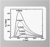 Chart:
when on the map the grid points associated to a shaking parameter (section Map Selection on the left of the map) are visualized the button is enabled.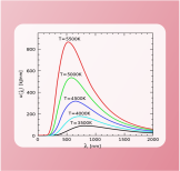 Clicking on the button the functionality is activated and the button turns to active.
 When the button is active, click on the point of the map for which the chart is required.
On the bottom of the page the chart (hazard curves if the map is about a parametre of PGA;
uniform hazard spectra if the map is about a parametre of of specctral acceleration) and the associated table of data are presented.
When the button is active, click on the point of the map for which the chart is required.
On the bottom of the page the chart (hazard curves if the map is about a parametre of PGA;
uniform hazard spectra if the map is about a parametre of of specctral acceleration) and the associated table of data are presented.
 Disaggregation:
when the map shows the grid points about a PGA shaking parametre (section Map Selection on the left of the map) the button is enabled: Clicking on the button the funcionality is activated and the button turns to active.
 When the button is active, click on the point of the map for which the disaggregation is required.
On the bottom of the page the chart and the associated table of data are presented.
When the button is active, click on the point of the map for which the disaggregation is required.
On the bottom of the page the chart and the associated table of data are presented.
 Export to Pdf:
when on the map the grid points associated to a shaking parameter (section Map Selection on the left of the map) are visualized the button is enabled. Clicking on the button the funcionality is activated and the button turns to active.
 When the button is active, click on the point of the map for which the PDF report is required.
The Pdf document is opened in a new window of the browser, and users can save the document on their own PC.
When the button is active, click on the point of the map for which the PDF report is required.
The Pdf document is opened in a new window of the browser, and users can save the document on their own PC.
On right the following buttons are always available:
 Italiano:
Click the button to open the italian version of the site. Help:
Help:
Click to view this page.
Q. What are the provided hazard values?
The site provides:
- seismic hazard values in PGA for 9 probabilities of exceedance in 50 years (2%, 5%, 10%, 22%, 30%, 39%, 50%, 63%, 81%), evaluated on three percentiles (16th, 50th, 84th). For these values the associated disaggregation is also available
- seismic hazard values in terms of acceleration for different spectral periods, Sa, associated to 10 periods of engeneering interest (0.1, 0.15, 0.2, 0.3, 0.4, 0.5, 0.75, 1.0, 1.5, 2.0 seconds) and 9 probabilities of exceedance in 50 years (2%, 5%, 10%, 22%, 30%, 39%, 50%, 63%, 81%), evaluated on three percentiles (16th, 50th, 84th)
Q. Why values and graphs are not always available for Sardinia and other islands?
For some areas (specifically islands areas) the methodology used at national scale did not provide reliable results.
Therefore, for these areas specific analyses were performed, whose results are described in deliverable D1 of this project
(http://esse1.mi.ingv.it/d1.html).
Commonly for these areas only one hazard value was provided: PGA with probability of exceedance 10% in 50 years.
Therefore the associated hazard curves (and related graphs) are not available.
For the elastic design spectra graph, it was used that defined by Eurocode 8 for the same probability of exceedance
(see the deliverable D3 of this project: http://esse1.mi.ingv.it/d3.html).
Also the disaggregation analyses are not available for these areas.
Q. How to ask for the visualization of the map for a specific parameter value?
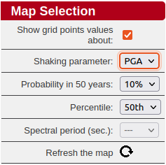 To ask for the visualization of a specific value the user has to set the parameters to define it (in the section Map Selection on the left of the map).
Where PGA values are required the user must select the values of Probability in 50 years and Percentile.
Where Sa values are required the user must also select the value of Spectral Period, whose selector will become active in this case only.
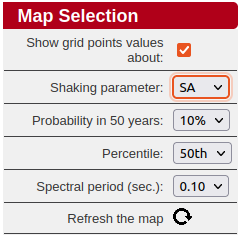 Finally the user must click on the button Refresh the map to get the required map.
Q. How to get the detailed information for a specific node?
TTo get details for a single node, the corresponding shaking map must be visualized.
It is possible to get three different charts for each node of the grid:
- Seismic hazard curves: chart of the shaking parametre PGA against annual frequency of exceedence;
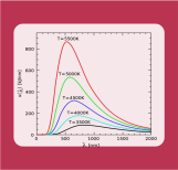
- Unifor hazard spectra: chart of the shaking parametre SA against the spectral period. One curve for each probability of exceedance in 50 years;
- Disaggregation of the PGA parametre.
To get the first two charts (PGA and UHS) it is required to click the button Chart (in the tool bar above the map) while the map shows
the required parametre. The button will turn to active:
Then click on the grid node of interest.
To get the disaggregation chart it is required to click the button Disaggregation (in the tool bar above the map)
while the map shows the PGA parametre, and then click on the grid node of interest.
Charts and table data in all cases refer to the selected values shown on the map:
- in case of PGA, the graph and table present all the available values of PGA (the annual probabilities of exceedance and the three percentiles) for the required point;
- in case of Sa, the graph and table present the values of Sa for the selected percentile only, and for all the probabilities of exceedance in 50 years;
- in case of disaggregation values of PGA, the graph and table present the percentage contribution to the seismic hazard of each couple of magnitude-distance values. The mean values of magnitude, distance and epsilon (ε) are also provided.
If the button Export to Pdf is selected, the user get a document in Pdf format
containing the main information on the node by selecting the grid node of interest. Specifically:
- a map at small scale of the area centred on the selected point, with the PGA values with probability of exceedence of 10% in 50 years on flat, rigid ground;
- the hazard curves and associated table data;
- the uniform hazard spectra (50° percentile only);
- the disaggregation chart of PGA value for a probability of exceedance of 10% in 50 years.
Q. What is the meaning of the disaggregation graph?
For a given grid point, the disaggregation analysis of PGA values shows the evaluation of the percentage contribution to the seismic hazard estimate
provided by each couple of magnitude-distance values.
This information is represented in graphical and tabular format.
For the point of interest are also presented, below the table, the mean values of M-D-ε.
This kind of analysis is useful to identify, in probabilistic terms, the seismogenic source, which most likely will generate the estimated shaking,
which is in turn useful for the microzonation analysis.
All the details on this type of analysis are inside the deliverable D14 of this project
(http://esse1.mi.ingv.it/d14.html).
The disaggregation is not available for islands mentioned above.
Q. How to read the values on the map?
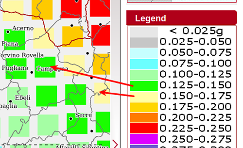 Referring to the selected parameter, the unit of measure of the hazard values is g (acceleration of gravity);
the values corresponding to the colors showed on the map are presented in the legend on the right of the map:
Referring to the selected parameter, the unit of measure of the hazard values is g (acceleration of gravity);
the values corresponding to the colors showed on the map are presented in the legend on the right of the map:
Q. How to visualize the points for which it is possible to check detailed results?
The points where it is possible to get detailed data are those shown in the map when the required hazard value is visualized.
Such points are easier to identify in the lower scales.
Q. How is it possible to move on a specific point on the map?
-
To change the center point of the map, select (in the tool bar above the map) the button Centre
and then click with the mouse on the point which should be the new centre.
-
To enlarge or shrink the map (within the range of the allwed scale: 50.000-5.000.000), centring on a specific point,
select (in the tool bar above the map) the button Zoom+
-
or Zoom-.
- It is possible to move the view of the map in a direction (right, left, up, down) by clicking on the corresponding edge of the map.
-
It is possible to zoom on a quadrilateral area: select (in the tool bar above the map) the button
Manual Zoom, activating the functionality.
-
Move the cursor to the upper-left corner of the area to zoom; keep the mouse left button pressed and drag
the cursor to the bottom-right corner to zoom. While dragging, the cursor must remain within the map, otherwise the selection is lost.
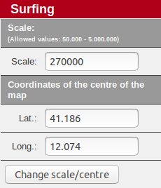 An alternative option is to provide the coordinates of the desired point in the section "Surfing" on the left of the map, in the box
Coordinates of the center of the map and to provide the zoom scale required in the box Scale.
An alternative option is to provide the coordinates of the desired point in the section "Surfing" on the left of the map, in the box
Coordinates of the center of the map and to provide the zoom scale required in the box Scale.
The provided coordinates become the new map center.
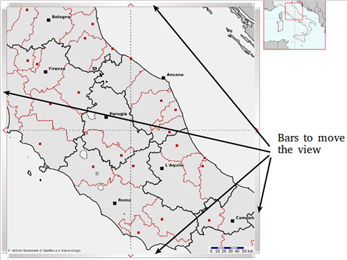 The main map is enclosed within four bar, one per side, which allow to move the view in the corresponding direction:
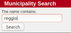 A single municipality center can be searched for through the tool Municipality Search.
A minimum of three consecutive letters in the name of the municipality it is required.
Then click on the button Search.
A single municipality center can be searched for through the tool Municipality Search.
A minimum of three consecutive letters in the name of the municipality it is required.
Then click on the button Search.
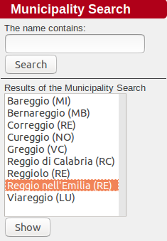 A list of Results of the Municipality Search is visulized.
In This way, after selecting the municipality from the proposed list, the municipality center becomes the new map center.
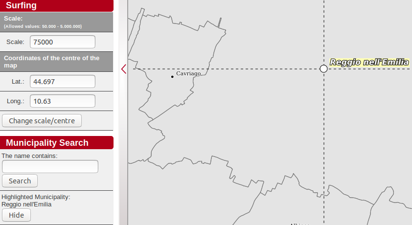 To remove the highlight of the municipality, click on the button Hide.
Q. Why borders of municipalities, provinces and regions are not always visualized?
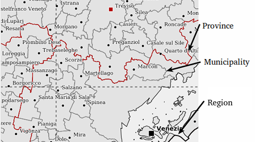 The visibility of the administrative borders (municipalities, provinces and regions)
and the associated chieftowns depends on the scale of the visualized map.
The visibility of the administrative borders (municipalities, provinces and regions)
and the associated chieftowns depends on the scale of the visualized map.
The lines of the three types of administrative borders are different, as shown in the following figure:
Q. How to know which part of Italy is actually represented on the main map?
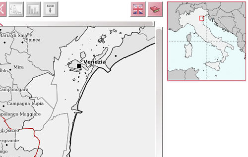 Near the map, on the top right, a little map of Italy where is pointed out the visualized area is always present.